I used to do this thing… I called it the “Bare Wall Stare.”
It’s that moment, coffee in hand on a quiet morning, when you’re sitting on your sofa, and your eyes land on that big, blank, echoing space above your bed or behind your dining table. And you just… stare.
You feel this ache for your home to feel finished. To feel like you.
So you do the browse. You hop online and find a gorgeous, abstract print you love, and your heart sinks when you see the $600 price tag. Then, you walk through a big-box store and see a $20 mass-produced canvas of glittery text, and your heart sinks for a different reason. It feels hollow. Impersonal.
The fear isn’t just about spending money. The fear is spending any money, or any effort, only to have the result look… well, cheap.
I’ve been on this journey for years, as a student and as someone who just deeply cares about the feeling of home. And here is the most important thing I’ve learned: Impact doesn’t come from a price tag. It comes from intention.
“Cheap” is a feeling, not a dollar amount. It’s the feeling of a generic, “good enough” placeholder. “High-impact” is the feeling of a story. It’s personal, it’s confident, and it’s something you truly love to look at.
You don’t need a big budget. You just need a new perspective. Here are 15 tips I’ve gathered—from trial and error, design school, and countless late-night internet deep dives—to help you fill your home with art that feels rich, personal, and you.

An Honest Review of the Simplehuman Pull-Out Can
There’s a design dilemma I’ve wrestled with in every kitchen I’ve ever…

The Psychology of ‘Refuge’: How to Arrange Your Living Room for How Humans Actually Sit
Your living room feels wrong, and you can’t figure out why. The…
10 Reasons Why You Shouldn’t Use Adhesive Hooks for Your Curtains
You’re jolted awake by that specific sound—the plastic clack, followed by the…
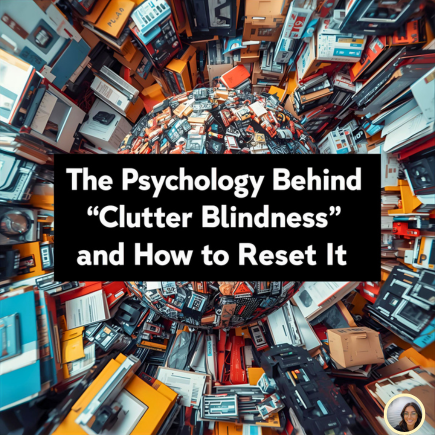
The Psychology Behind “Clutter Blindness” and How to Reset It
I had a “moment” a few months ago. It was one of…

The Truth About That “Magic” Shrinking Bag

An Honest Review of mDesign’s Stackable Bins
Let’s talk about the pantry. Or the cabinet under the bathroom sink….
1. The Foundation: It’s All in the Presentation
This is the secret that artists and galleries have always known. The right presentation can make a napkin doodle look like a masterpiece.
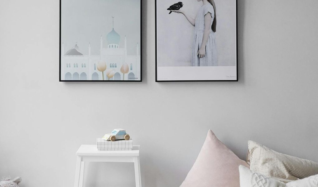
- Tip 1: Embrace the Giant Mat. This is my number one rule. Want to make a 4×6 photo, a postcard, or a simple greeting card look like it belongs in a gallery? Put it in an 11×14 or 16×20 frame with a huge, oversized mat. The “breathing room” creates visual importance and looks incredibly sophisticated.
- Tip 2: The Thrift Store Frame Flip. Scour your local thrift stores for old, dated frames (the more ornate, the better!). Ignore the art inside. Buy a handful of different shapes and sizes, take them home, and spray paint them all the exact same (or similar) color—a matte black, a soft gold, or even a deep navy. Suddenly, they’re a cohesive, custom collection.
- Tip 3: The “Floating” Mount. Instead of placing your art behind the mat, try “floating” it on top of the mat board. Use a small piece of foam board or a few acid-free foam dots to create a small shadow. This tiny detail makes the art pop and gives it a three-dimensional, custom-framing look.
A small realization: A frame is like a stage. It’s an act of respect for the object inside, telling the viewer, “Pay attention. This right here is special.”
2. The Source: Curate Your Own Story
The opposite of “cheap” is “personal.” When art tells a story—your story—it’s priceless. Stop thinking you have to buy “Art” and start thinking about what’s beautiful in your own life.
- Tip 4: Frame “Honest” Objects. That handwritten recipe from your grandmother? The one with the butter stains? Frame it. A beautifully typed letter from an old book, a pressed flower from a meaningful walk, a vintage map of your city. These aren’t art… until you frame them. Then, they’re heirlooms.
- Tip 5: Use the Public Domain Goldmine. This is a game-changer. The Met, The Rijksmuseum, the New York Public Library, and the National Gallery of Art all have vast online archives of stunning, high-resolution images—botanicals, sketches, Japanese woodblocks, architectural drawings—all free for you to download and print.
- Tip 6: Elevate Your Own Photos. We all have thousands of photos on our phones. Pick one. Not the perfect, smiling-at-the-camera one, but the other one—the close-up of your child’s hands, the abstract shadow on the sidewalk, the blurry-in-a-good-way shot from vacation. Print it in black and white, oversized, at a local copy shop.
- Tip 7: Frame Your Child’s Art… Seriously. Take that one scribble or painting you truly love. Don’t just stick it on the fridge. Frame it with a real frame and a mat. Treat it like a Picasso, and I promise you, it will feel like one.
A small realization: If you can buy it at any home store, it’s just decoration. If it’s your photo, your memory, or your discovery, it’s art.
3. The Impact: Go Big With Confidence
Often, what makes a room feel “cheap” or “in-progress” is a collection of tiny, “scared” items. One of the biggest design secrets is to not be afraid of scale.
- Tip 8: The DIY Textured Panel. You don’t have to be a painter. Get a large, blank canvas (or a piece of plywood) and a small tub of pre-mixed drywall joint compound. Using a putty knife, spread the compound across the canvas, creating beautiful, organic swipes and textures. Let it dry, then paint the entire thing one solid, matte color (like plaster white, deep charcoal, or earthy terracotta). It’s instant, high-end minimalist art.
- Tip 9: Fabric as a Feature. Did you find a stunning vintage scarf? A beautiful remnant of fabric? A tea towel with a graphic print you love? Instead of (or in addition to) framing it, you can build a simple, cheap wood frame (or buy a canvas stretcher) and wrap the fabric taut, stapling it in the back. It’s a huge, soft, textural piece for a fraction of the cost.
- Tip 10: The Single Object Display. Sometimes the art isn’t a picture at all. It’s an object. A beautiful, sculptural branch you found, a set of rustic boat oars, a collection of straw hats arranged with intention, or a vintage mirror with a beautiful patina.
A small realization: A single, large piece of art feels more confident and calming than a dozen small, scattered items. Don’t be afraid to take up space.
4. The Arrangement: How It All Comes Together
This is the final layer of intention. It’s not just what you hang, but how you hang it.
- Tip 11: The “Grounded” Gallery Wall. A random, “exploding” cluster of frames can look chaotic. To make a gallery wall look intentional, give it an anchor. Align all the frames along a single horizontal line (either the center, the top, or the bottom). This invisible structure makes the whole collection feel calm and cohesive.
- Tip 12: The Ledge Lean. Forget nails entirely! A few simple picture ledges (like the MOSSLANDA from IKEA) are my best friend. They create a relaxed, layered, studio feel. You can swap art in and out in seconds, layering small frames in front of big ones. It’s perfect for renters and creative minds who change their minds.
- Tip 13: Light It Up. This is the ultimate “looks expensive” trick. Add a small, plug-in (or battery-operated) picture light above a single frame or a gallery wall. The moment you turn it on, you’ve transformed a $10 print into a feature.
- Tip 14: The Triptych Trick. Find one large, inexpensive print (or a high-res digital image). Buy three identical, simple frames. Cut the print into three equal vertical sections and frame them, leaving a small, 1-2 inch gap between each frame when you hang them. It’s an instant, professional gallery-style piece.
- Tip 15: Let It Breathe. The most overlooked tool in design? Negative space. Don’t fill every wall. A quiet, empty wall is not a failure—it’s a moment of rest for the eyes. It makes the art you do have feel even more important.
You’re Not Decorating; You’re Curating
That “Bare Wall Stare” doesn’t have to be a moment of frustration. It’s not a problem to be solved or a space to be filled.
It’s an invitation.
It’s an opportunity to ask yourself: What do I love? What’s my story?
Your home is your autobiography, and the things you place on your walls are the illustrations. The goal isn’t to look “not cheap.” The goal is to look loved. To feel intentional.
So start small. Find one thing. One postcard, one old photo, one beautiful thrifted frame. Put it up. See how it feels to have a piece of your story looking back at you. I promise, it will feel like the richest thing in the world.
The Psychology Behind “Clutter Blindness” and How to Reset It
I had a “moment” a few months ago. It was one of those embarrassing, life-in-sweatpants,…